Pantone for Billboards
Pantone for Billboards for can be a little tricky. However, while incredibly useful for ensuring color consistency, can seem complex due to several factors:
▸ Process Colors (CMYK): These colors are created by mixing the four base inks: Cyan, Magenta, Yellow, and Black. CMYK is suitable for reproducing a wide range of colors but may not perfectly match every Pantone color.
▸ Variations Based on Material: The same Pantone color appears differently depending on the substrate (paper type, fabric, etc.) it’s printed on. Pantone includes different libraries (e.g., Coated and Uncoated) to address this, and choosing the appropriate library is crucial for accurate color reproduction.
▸ Subjectivity: Color perception is subjective, and different individuals may perceive the same color slightly differently.
▸ Printed Guides: Pantone’s physical swatch books are critical tools, but they can fade over time due to light and handling, affecting color accuracy. Pantone recommends replacing these guides regularly (every 12-18 months) to ensure optimal color matching.
Pantone color combinations change every few years, so it is best to stay up to date with the newest Pantone updates.
Example of Pantone Differences
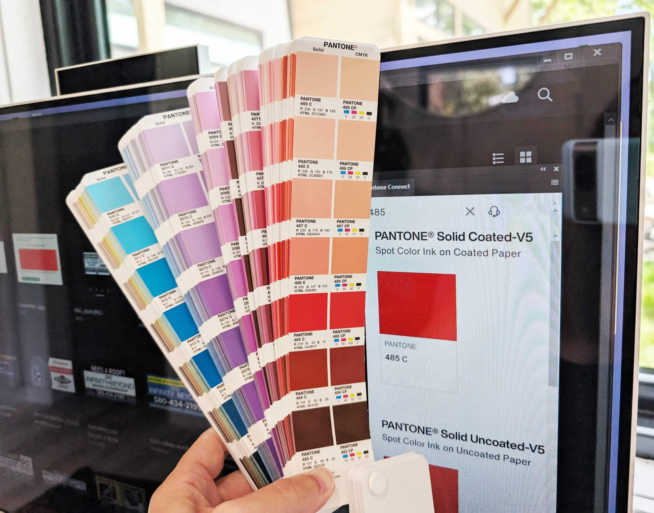
Here is an example of color disparity between a computer screen, Pantone Color Bridge C and CP Solid Coated. We chose PMS 485 CP.
As you can see PMS 485 presents a little differently verses computer screen and color bridge. It is important to not pick colors for your brand or ad based on the way it looks on a computer screen. All large format printers print using the “CP” and not the “C”.
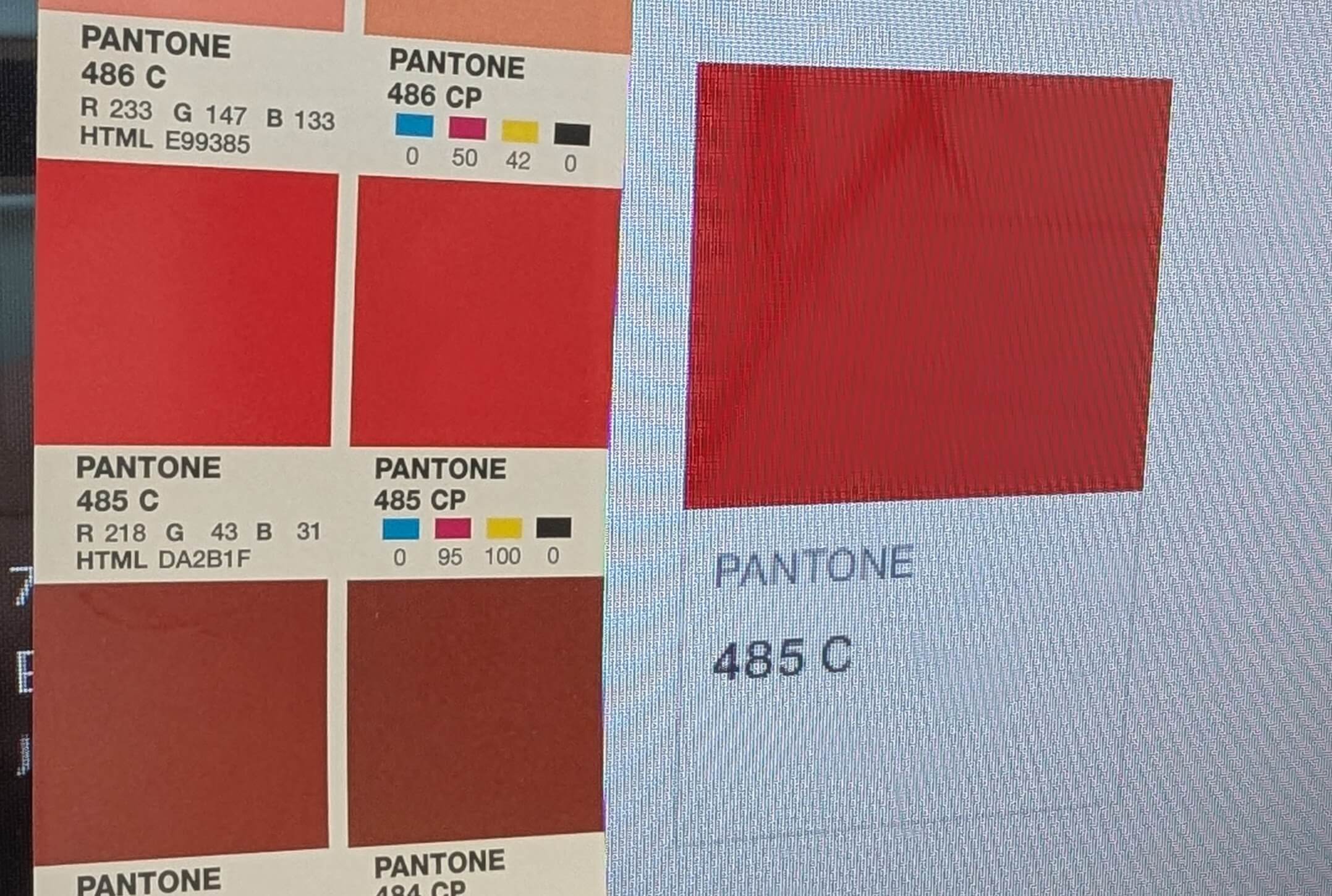
▸ “C” Coated indicates a solid Pantone color intended for coated paper stock and is used for digital formats.
▸ “CP” Coated Process is an approximation of the real Pantone color using CMYK. CP would be on a press or printer that has cyan, magenta, yellow and black ink. “CP” is the color guide that all large format printers use.
▸ “CP” colors seem to present a little duller than its “C” counter part.
If you are confused, that is ok. This even stumps seasoned designers. It is important to explore a Pantone Color Bridge to make sure your print comes out as expected.
Example of Pantone Differences
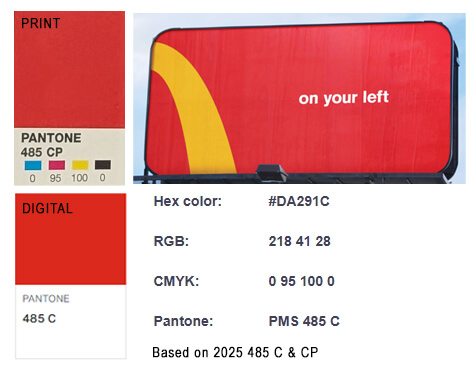
One of the most popular brands is McDonalds. They use 485 C for digital and 485 CP for printed materials. 485 CP will print slightly differently depending on the medium they are printing on and because it is a CMYK process.